Hey! Working with multiple chats is a really cool feature, but it’s so hard to tell often what the chat is for. Right now the titles on the tabs are heavily truncated, even when there are a few tabs open.
Maybe we could make it more like chrome, where the tabs start out longer, and then get smaller when there are more of them.
They could be a lot longer when they are like this. I can barely tell what the “Remove unnecessary…” tab was about.
Improvements here would be much appreciated

Hey, thanks for the suggestion. The current truncation of chat tab titles really does make it hard to distinguish conversations, especially when you have many.
Chrome-style adaptive tab width is a great UX pattern: with fewer tabs they’re wider, and as the number grows they shrink. This fits chats well, where context matters for quick switching.
I’ll make sure to pass this feedback to the team. Better tab management for multi-chat scenarios would definitely improve usability, especially as more users work with multiple chats.
Could we also get a little spinner in the tab, that would show which tabs are “running” so you know that
1 Like
It might be worth adding a system similar to traffic lights, using different colors to represent different statuses, which would also make it easier to manage different conversations.
1 Like
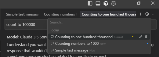
Making the tabs smaller would be great, since there is already a tooltip for when you hover over them. But to be honest, the chat history dropdown or Agent panel would be easier to find your chats I think.
In regards to the light indicators or spinners to show which chats are active/unread. This already exists in the Agent panel (light indictors and timers) and in the chat history panel (light indicators). It would be helpful to also have them in the tabs, but the tabs are already crowded as it is, but I think the light indicators would be more helpful than the tab labels.