Dear Cursor-Devs,
I know this might be a long shot but I would be interested in a transparency feature for better harmonizing usage expectations with model availability.
Where am I coming from with this?
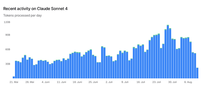
You know the google maps feature that allows us to plan trips including planned arrival time based on projected traffic on the shared infrastructure (i.e. roads)? We are in a similar situation with cursor – only that not the roads are the shared infrastructure but the models and how they are used throughout the day.
Feature Request:
As a user, I would like to be able to see the projected use of models through out the day to better plan may coding activities.
Specific current example:
GPT-5 free campaign; I sometimes need to go down from “fast” option to the “non-fast” option because the shared infrastructure currently is at its limit.
Other scenario where this might be helpful:
getting the most out of “Auto” mode (I assume that not only the prompt itself is responsible for chosing the best model for a task, but also model availability as outlined above).
@community: feel free to add further ideas, where this might be helpful, if you share this idea.
This feature certainly requires some more thoughts to fully specify it but I thought I just drop the idea here. Maybe you (cursor devs) or other users deem this a reasonable feature to further jointly elaborate on.
