After upgrading to the latest version ( 2.6.20), when the activity bar is set to vertical mode, there is a big gap at the bottom of the side panel, which does not match the theme color. Even when all the panels are expanded, it stays there still.
Steps to Reproduce
Set the activity bar to vertical mode.
Expected Behavior
No gap at the bottom like in the horizontal tab view.
There is now an empty gap/space at the bottom of the primary sidebar. No matter quiting and reopening cursor it still shows it. “workbench.activityBar.orientation”: “vertical”, has to be vertical to see it. Only happened after upgrading to the newest version!
Steps to Reproduce
Upgrading the newest version has caused this, you can see at the bottom of the primary sidebar.
and set “workbench.activityBar.orientation”: “vertical”,
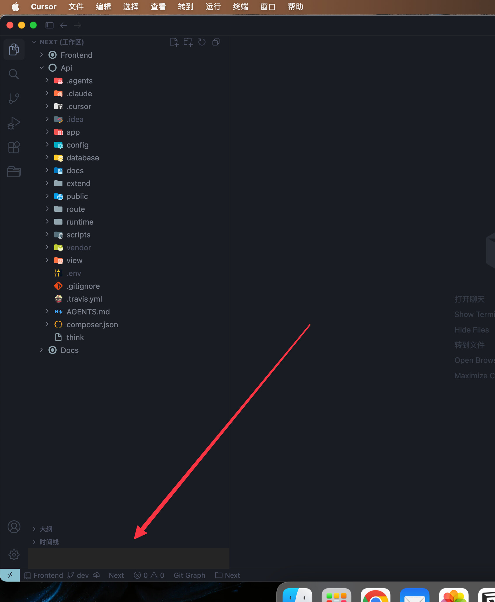
In the primary (left) sidebar, a solid light-grey rectangular area appears at the bottom, just above the status bar. It sits next to the account and settings icons and looks like empty/incorrectly painted UI rather than intentional content. The rest of the sidebar uses the dark theme; this block stands out and has no label or controls.
Steps to Reproduce
Open Cursor with the primary sidebar visible (left).
Open views that use the bottom of the sidebar (e.g. Outline, Timeline, References, Dependencies — as in the screenshot).
Look at the bottom of the sidebar, above the status bar, beside the profile and gear icons.
Observe the light-grey rectangular region with no text or icons.
Expected Behavior
The sidebar bottom should match the theme with no stray empty grey rectangle; that area should either show normal chrome, proper empty state, or nothing—not a mismatched grey block.
When workbench.activityBar.orientation is set to “vertical”, a small white rectangle appears at the bottom-left corner of the window, where the activity bar column meets the status bar. This does not happen in VS Code with the same setting.
The root cause appears to be that Cursor’s CSS sets .monaco-workbench { background-color: transparent !important }, which exposes the default white background through a gap in the layout grid that is not covered by any UI part (activity bar, sidebar, or status bar).
Steps to Reproduce
Open Settings (JSON) and add “workbench.activityBar.orientation”: “vertical”
Restart Cursor
Look at the bottom-left corner of the window, below the gear/account icons on the activity bar
Expected Behavior
The corner where the activity bar meets the status bar should be filled with the theme’s background color (matching the activity bar or status bar), as it does in VS Code with the same setting. Instead, a small white rectangle is visible regardless of which theme is active.
The root cause appears to be in Cursor’s CSS: .monaco-workbench { background-color: transparent !important }. This rule makes the workbench background transparent, exposing the default white background through a gap in the layout grid at the intersection of the activity bar column and the status bar row. VS Code does not have this rule, so the issue does not occur there. The white block persists across all light themes tested (Solarized Light, Terracotta Cream).
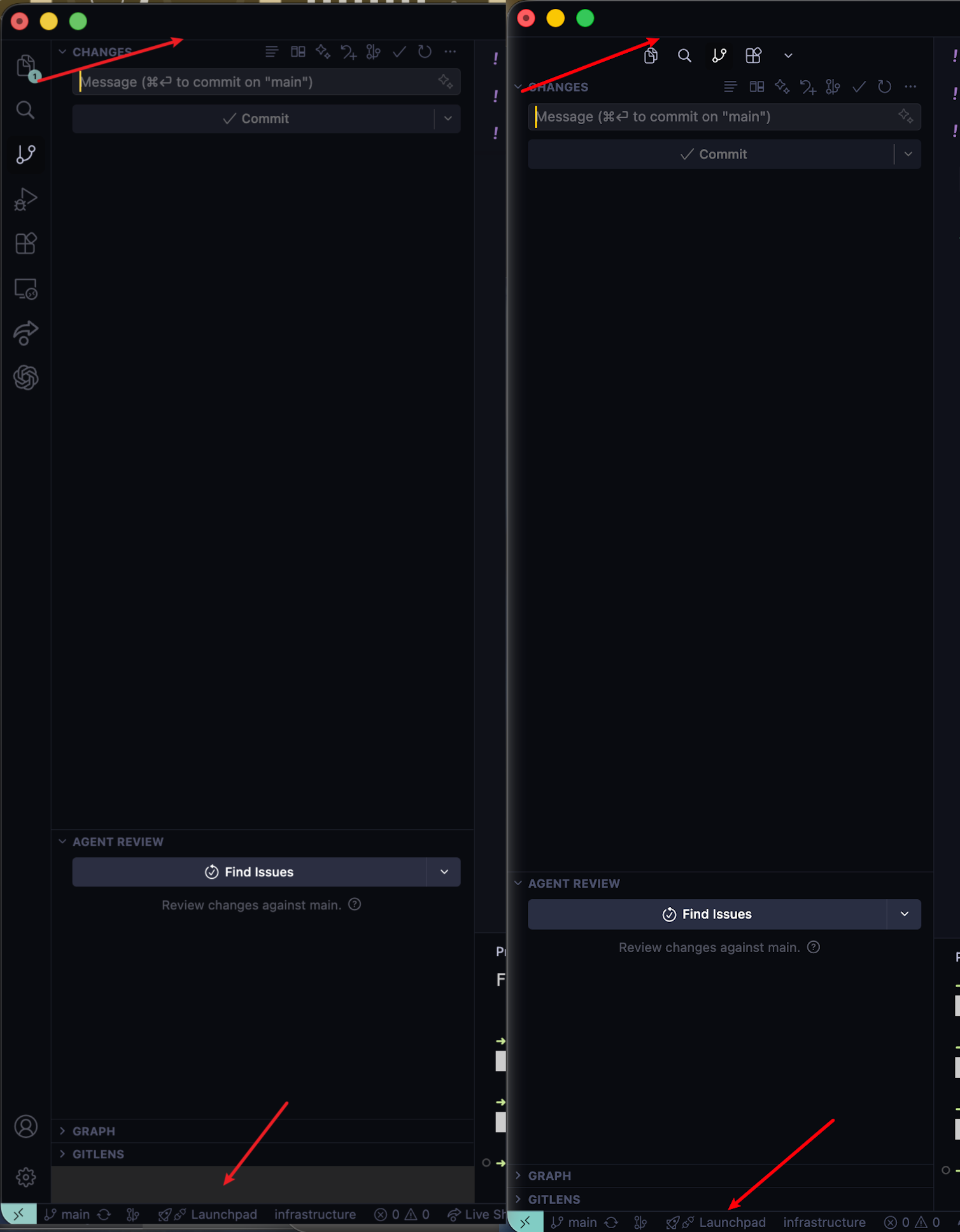
There is a persistent blank/grey area at the bottom of the Source Control sidebar, below the GRAPH section. The space is not part of GRAPH or any other collapsible panel — it appears as an unclickable dead zone between the last section and the bottom status bar. The issue occurs whether or not the AGENT REVIEW and GRAPH sections are visible.
Steps to Reproduce
Open Cursor IDE
Navigate to the Source Control sidebar (click the Source Control icon or Ctrl+Shift+G)
Observe the blank grey area below the GRAPH section (or below the last visible section)
The blank area persists regardless of whether AGENT REVIEW and GRAPH sections are visible or collapsed
Resetting view locations (View: Reset View Locations) and reloading the window (Developer: Reload Window) does not resolve it
Expected Behavior
The sidebar sections should fill the available space without leaving a blank grey dead zone. No empty area should appear below the last visible section.
The extra color area rendering issue in the bottom left corner has been fixed in a recent Cursor update. Updating to the latest version should resolve this.