A quick one, but with VS Code, files inside Windows Explorer (win10) used to have different icons depending on the filetype, (.ts, .js, .tsx, .vue, etc…)
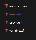
Now with Cursor they look like this:
It makes it harder on the eyes and also hard to tell file types apart, would love to see this solved.
Just replying here to say the same. Was doing a search to figure this out and came across this post.
It’s annoying having all of the icons that were previously file-specific now replaced with the Cursor icon if I want to use it as the default editor over VSCode. As a whole I feel like the Cursor icon (at least the application icon) should be mildly redesigned to work better at small sizes (like file icons) as currently it’s a bit annoying to look at. At least remove the black background/box and instead focus on the symbol in the middle of the box. Right now it just doesn’t scale well and as a result doesn’t stand out much which isn’t helped by the muted black and white color scheme. Considering the icon on the site doesn’t appear to have said black box around it, I’m guessing it was added to contrast the icon against light backgrounds but ultimately just bogs it down.
I’ve actually gone as far as making a red variation of the VSCode Cursor icon (all resolutions and repacked) that I’ve been slapping into Cursor via Resource Hacker as it’s a lot easier on the eyes and more immediately recognizable in file and application lists.
Also, noticed the cursor window itself doesn’t even have an icon(?) Just seems to be some sort of default window one or something. I couldn’t even find it in Resource Hacker to replace it
I would post the .ico resource file I made for anyone who wants to use it but alas I don’t know if that would be against the rules and I’d have to do it as a link anyway since apparently .ico files are disallowed as image attachments.
It doesn’t solve the per-file-type icon issue, but it does at least make it easier to look at.
When I have a min I’m probably going to replace it with a variation on the icon pulled from this site instead, albeit maybe with some color to make to make it stand out.
Edit: Did that. Made other variations but found the “Cursor” by itself with some color made it easier on my eyes.