In the newest version, the floating “pending changes” review bar (the one that appears when the AI suggests inline edits - showing navigation between files with pending changes and between each diff in a file in addition to the accept/decline all file changes buttons) was moved from the bottom of the screen to the top-right corner.
This change has made the interface significantly more annoying to use; It seems like I have to constantly shift my focus between the code I’m working on and the corner of the screen. The new position also makes it much less noticeable that there are pending code changes.
Previously, the bar floated near the editor’s bottom edge, which made reviewing AI changes intuitive and fast. It was “in your face” so to speak but that to me seems like the main point of an AI code editor.
I see no reason changing a prominent part of the interface like this should be hardcoded and not a setting, so as a paying costumer I’d like to report this as a very bothersome bug.
Please either:
Add a setting to control the placement of the pending-changes review bar, or
Provide a way to revert to the previous UI layout, or
Allow users to freeze Cursor at a prior version until this can be made configurable.
The previous interface was perfect for my workflow — I genuinely don’t need innovation in this specific area, just consistency.
Steps to Reproduce
Open any file in Cursor.
Ask the agent to edit something.
Observe where the pending-changes / accept-reject bar appears — it now spawns top-right.
There’s no apparent way to move it or restore the old behavior.
Expected Behavior
The floating “pending changes” / diff bar should appear near the bottom-middle of the screen or be configurable in position (bottom, inline, top-right…).
I’ve only just now noticed how it looks like when you’re in another file and there are pending code changes to a different file. My second post in this suggestions thread from yesterday: UI changes in today's update - #5 by user808
AI code suggestions being THAT unapparent in an editor whose entire shtick is providing AI code suggestions?
It’s worse – that button to accept changes does not always appear - now I have to scroll through and click the tiny little accept checkmark on every code change in the chat… and there seems to be no place to fix or control this in settings.
I may be mistaken, but I recreated the situation in the screenshot by changing to “Agents” view, and the undo/keep buttons appeared at the bottom like normal when I was in “Editor” view. Does it occur in both views for you? Or are you referring to different UI elements than the one in the screenshot?
I tried out the agent view, that’s basically just full screen ai thing like chatgpt? I definitely didn’t accidentally switch to that and not notice the change. I tried switching back and forth either way to see if it fixes it, but Editor view still has the weird positioning of the pending changes buttons.
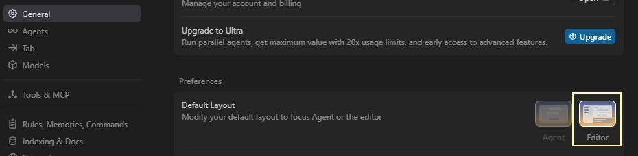
What version of Cursor are you on by the way? Your settings look fancier than mine:
If you aren’t in v2, then I don’t think you have the settings that I was referring to. Can you provide a screenshot of where the pending changes buttons are?
My screenshot you linked above. Where the red arrow is pointing, in the top right of the screen. That’s where the accept/deny all changes, and move between files with pending changes is located for me and the others in this thread. I am on 1.7.54 as the bug report says. Is the 2.0 a very new thing? Is it stable release? My Cursor updates all the ■■■■ time (to stable versions), how come I’m not on 2.0 too?
i am not 1.7 and have this issue too
Version: 1.7.54 (Universal)
VSCode Version: 1.99.3
Commit: 5c17eb2968a37f66bc6662f48d6356a100b67be0
Date: 2025-10-21T19:07:38.476Z
Electron: 34.5.8
Chromium: 132.0.6834.210
Node.js: 20.19.1
V8: 13.2.152.41-electron.0
OS: Darwin arm64 25.0.0
The new position was a big improvement over the old position, it just took a little time to get used to.
The old position was prone to missclicking the due to positional changes of the buttons.
If you’re going to keep it at the bottom, please bake the buttons into set positions in the chrome so its not a floating or resizing box that moves around all the time.
Clicking “Approve” once only to click again and hit a button labelled “Undo” is awful UX.